
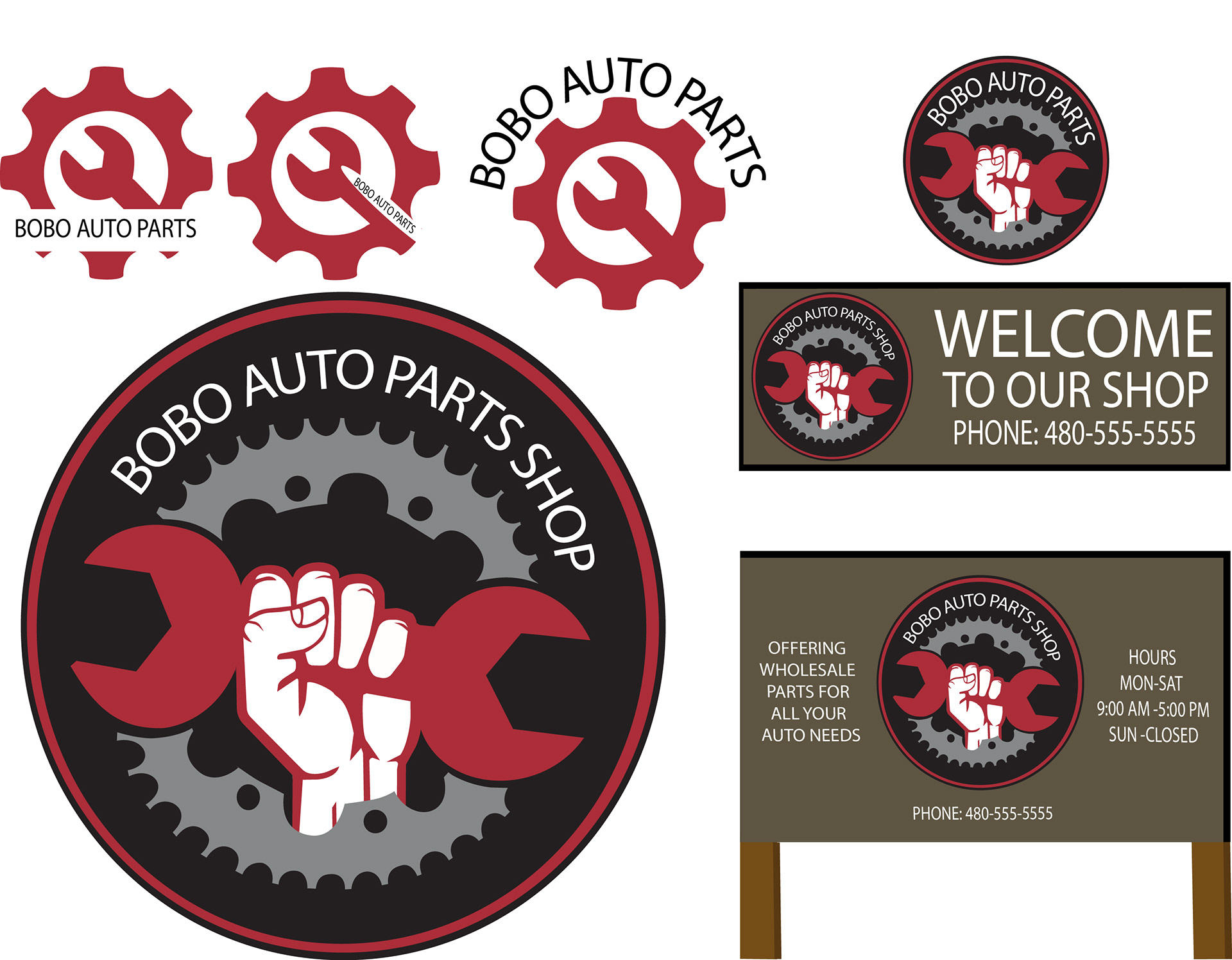
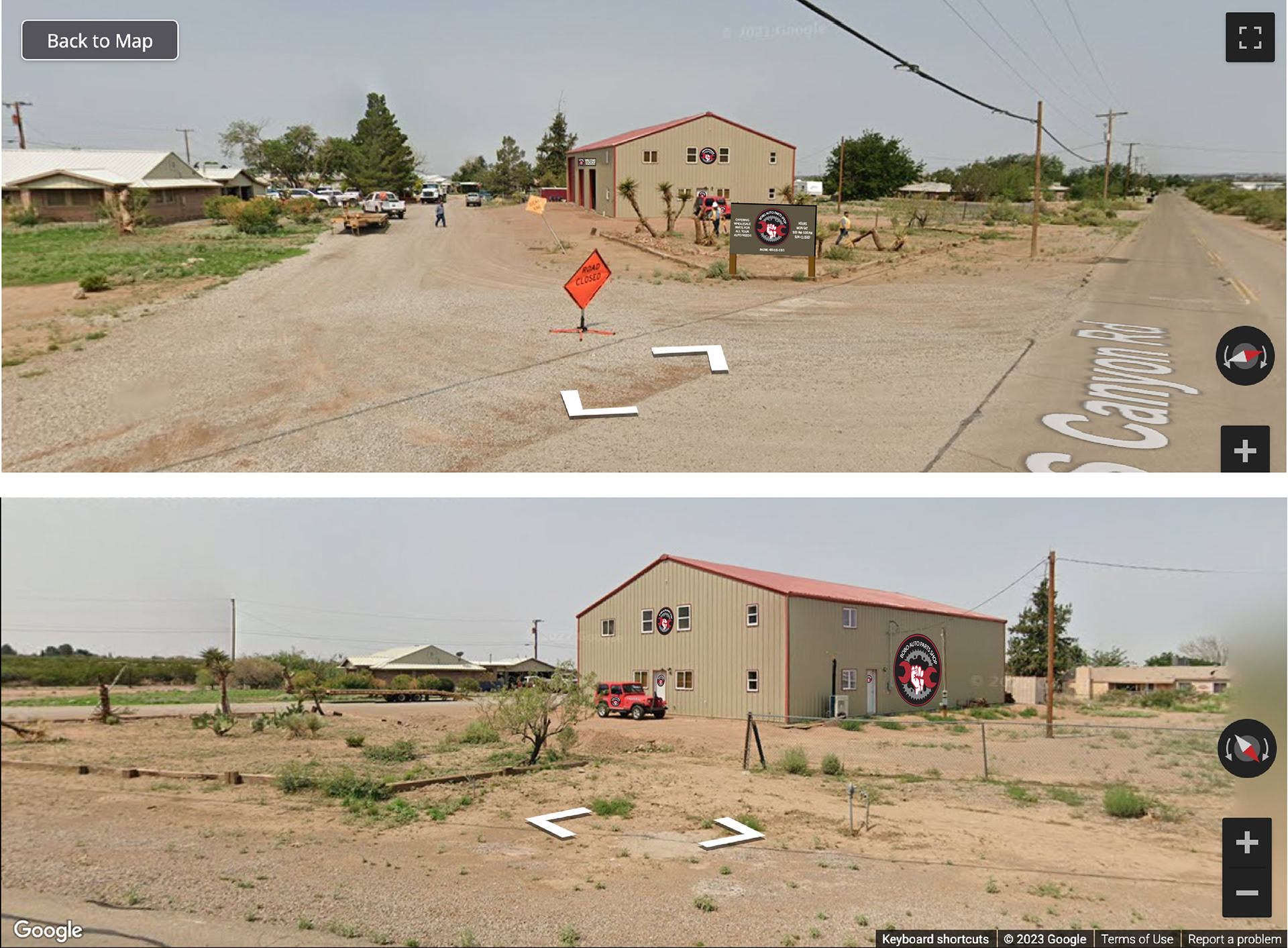
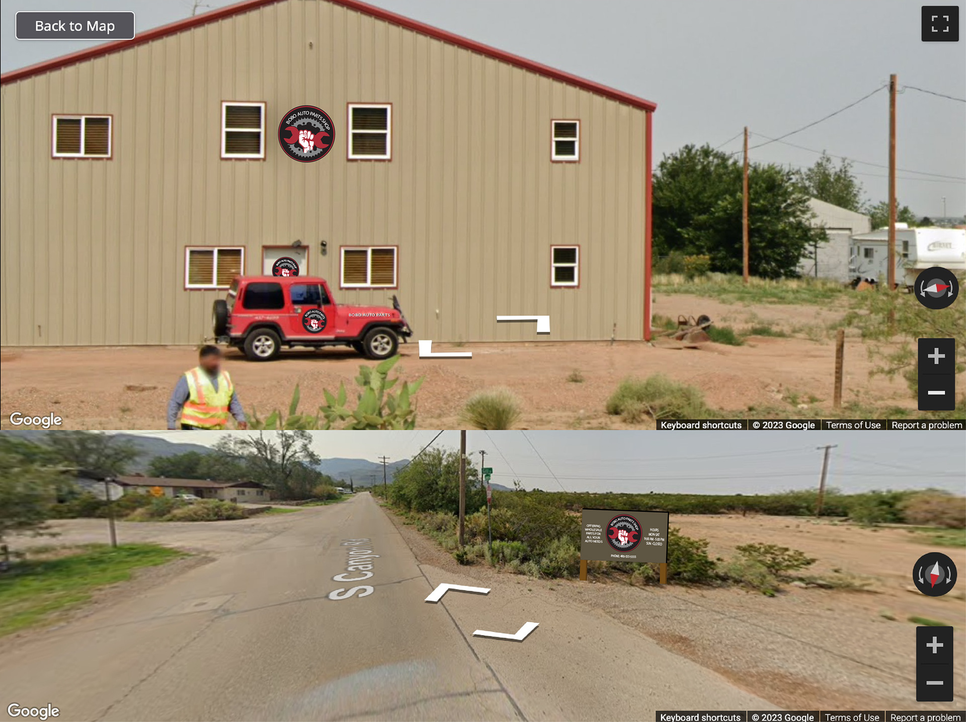
BoBo Auto Parts shop in New Mexico wanted a new logo and signs for their Auto Shop so I created the logos and mockups of their land to show them what their shop could look like.
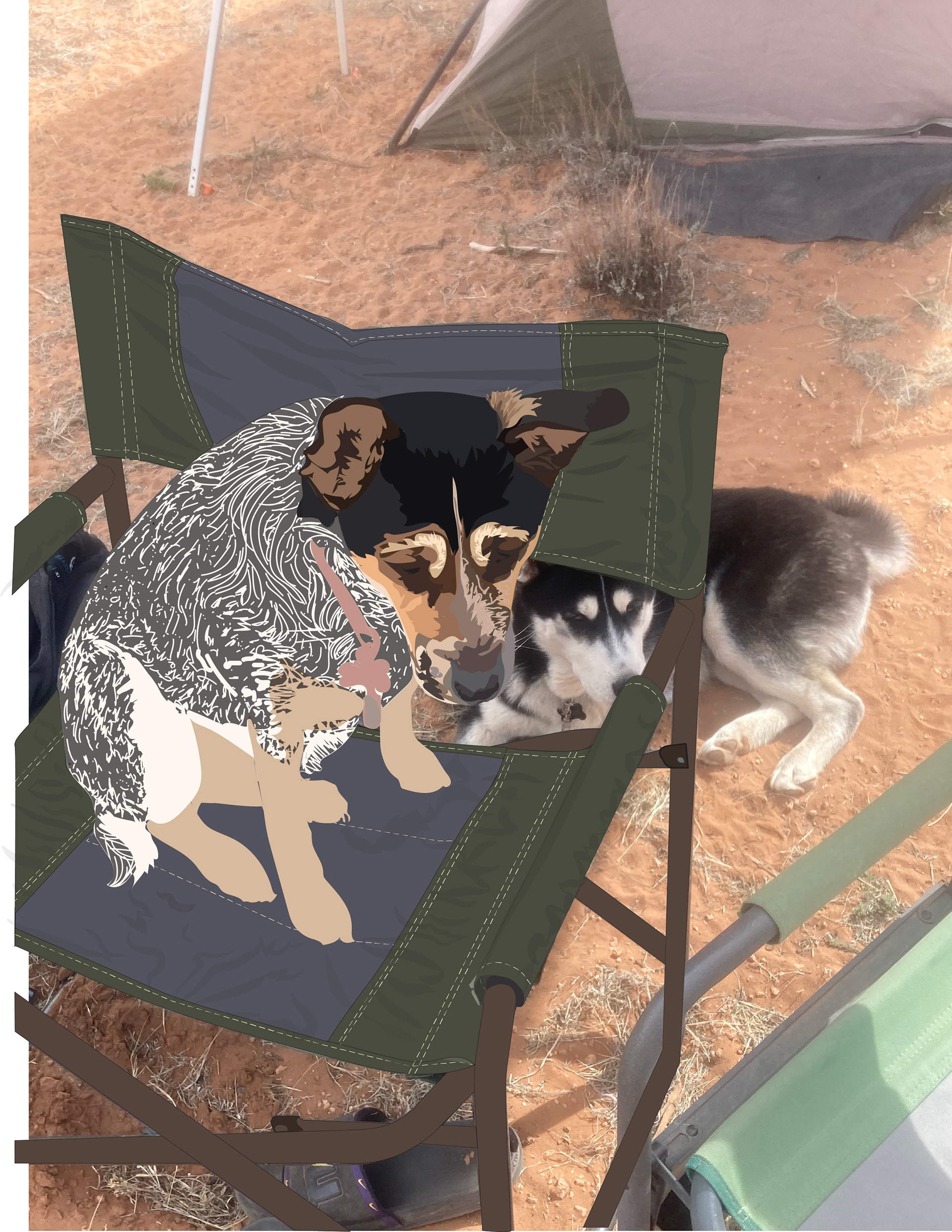
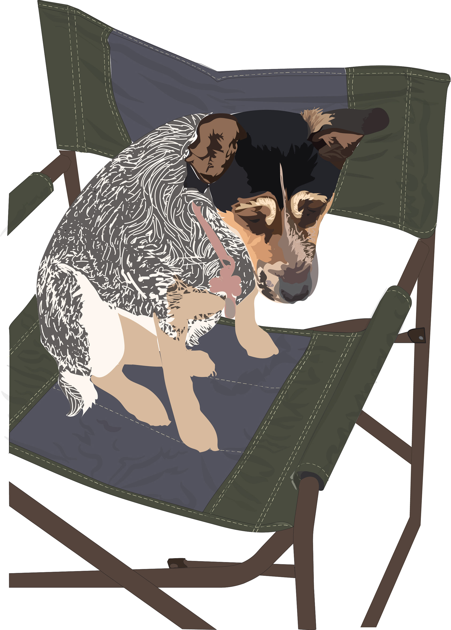
Vector that was recovered from a crashed computer that is still in progress of Lulu and Sorin, Lulu is on the chair I took the picture and was experimenting with textures and colors to make the image as seen.
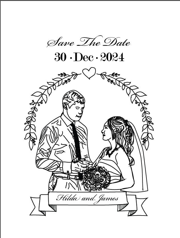
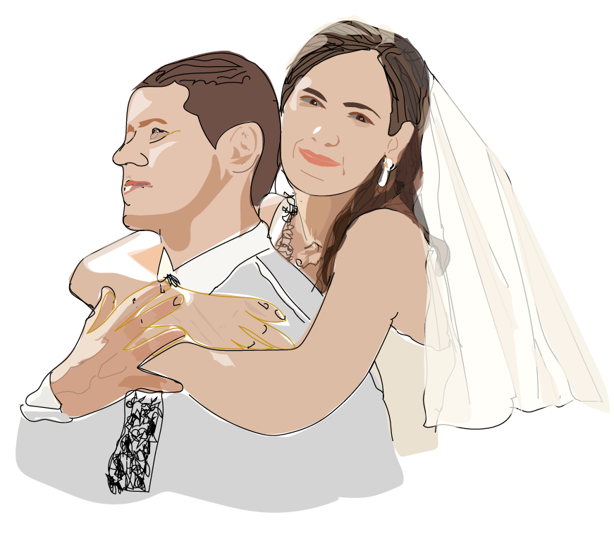
Mock ups for a customer who wanted wedding anniversary cards and a T-shirt design to be worn for the party with the pictures that were supplied in Adobe Illustrator.
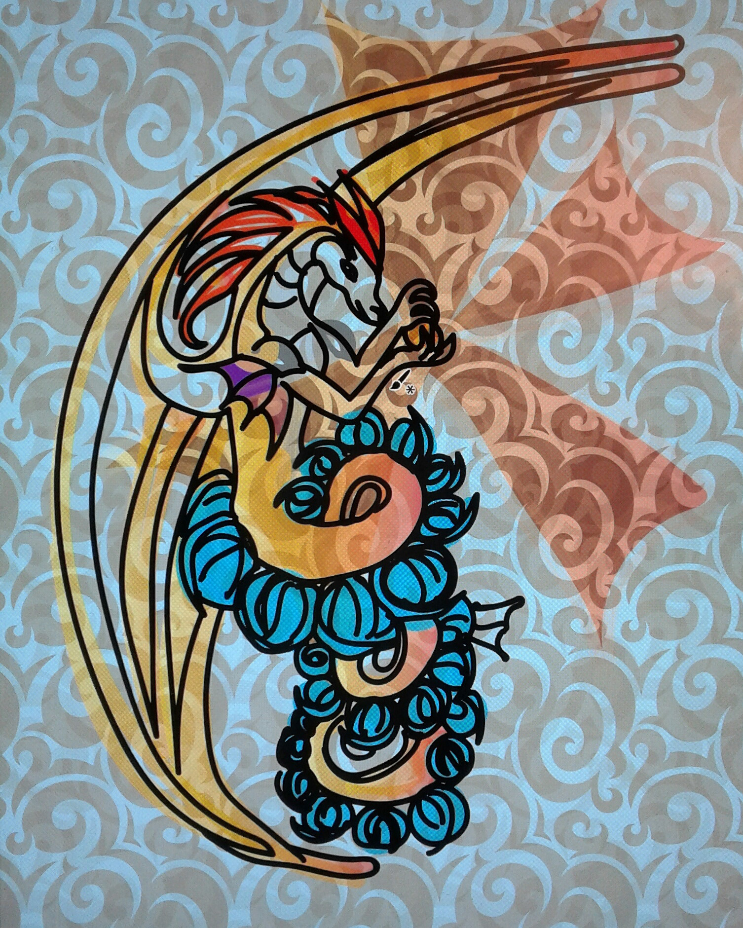
A drawing of a sea dragon was vectored and effects were added in Adobe Photoshop and Adobe Illustsrator to create this quick piece to experiment and see what could be created using vectors and crossing over from photo to quick drawing, This was also created as a blacklight drawing besides being a quick vector.
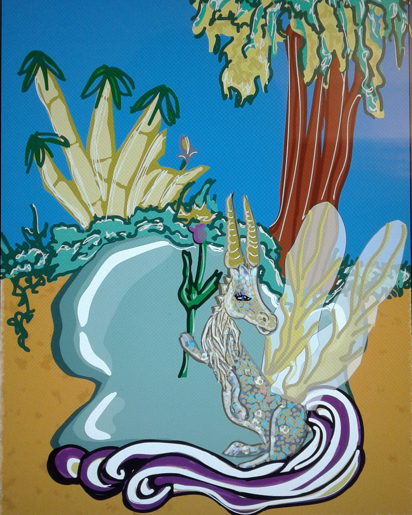
The Unicorn was a single line drawing that was converted into a vectorized drawing in Adobe Illustrator and effects were added to experiment with drawing in Adobe Illustrator coupled with transparencies and effects to see what was possible to create, experienting with layering and painting colors on top of the drawing.
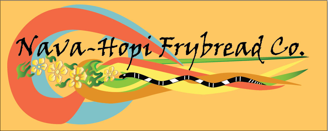
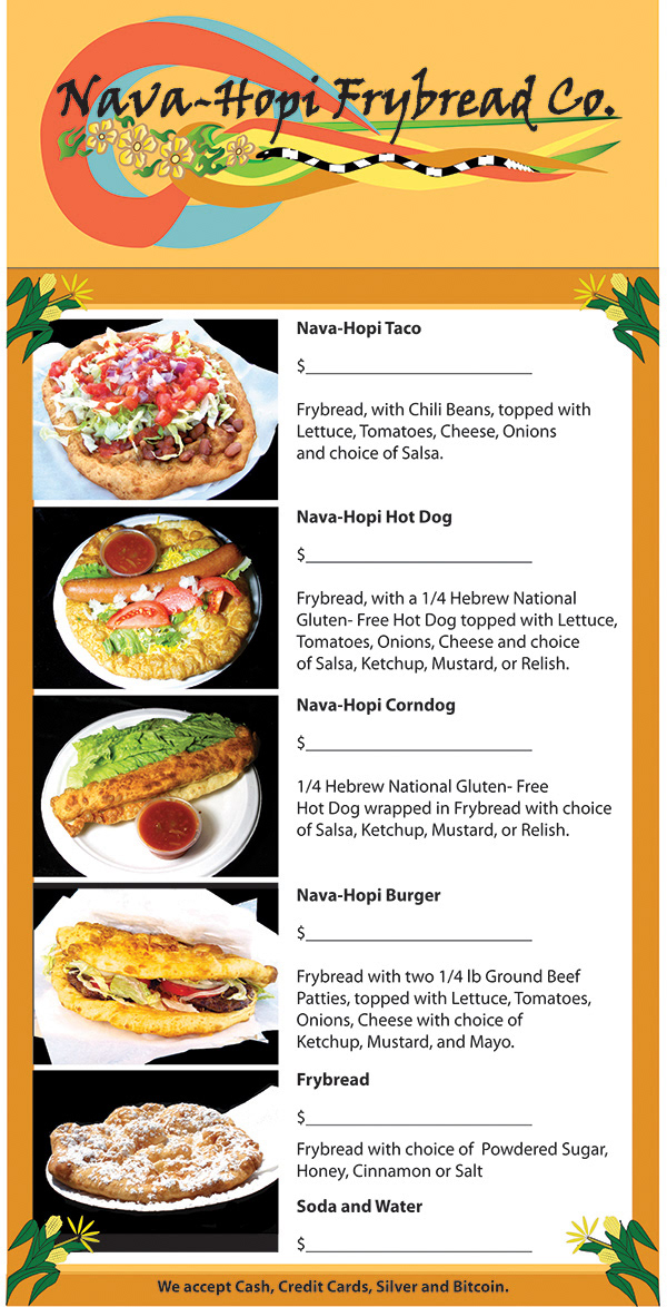


Nava-Hopi Frybread Company is a Navajo and Hopi mix of Native Americans that Create Navajo Tacos, Frybread, Corn Dogs, Burgers and more. A new logo was created for festivals, and events in 2ft by 10ft size banners. The logo was created from vector objects and from taking a picture of two Navajo and Hopi tattoos combined to show both clans in one logo.


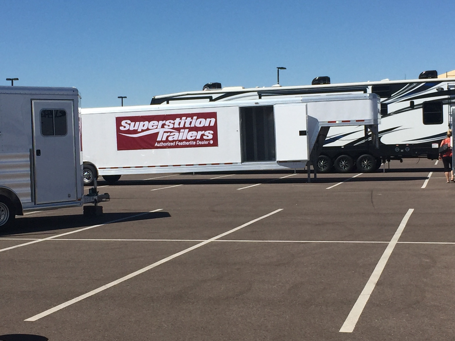
Superstition Trailers recently changed their logo to exclude the Truck and trailers part of the logo to simplify the logo for it's light weight trailers to a red and white logo to represent light weight trucking. Other logos were designed to go along with the final red and white reversed logos for the trucks and the buildings with an output to a 2ft by 6ft size banner.
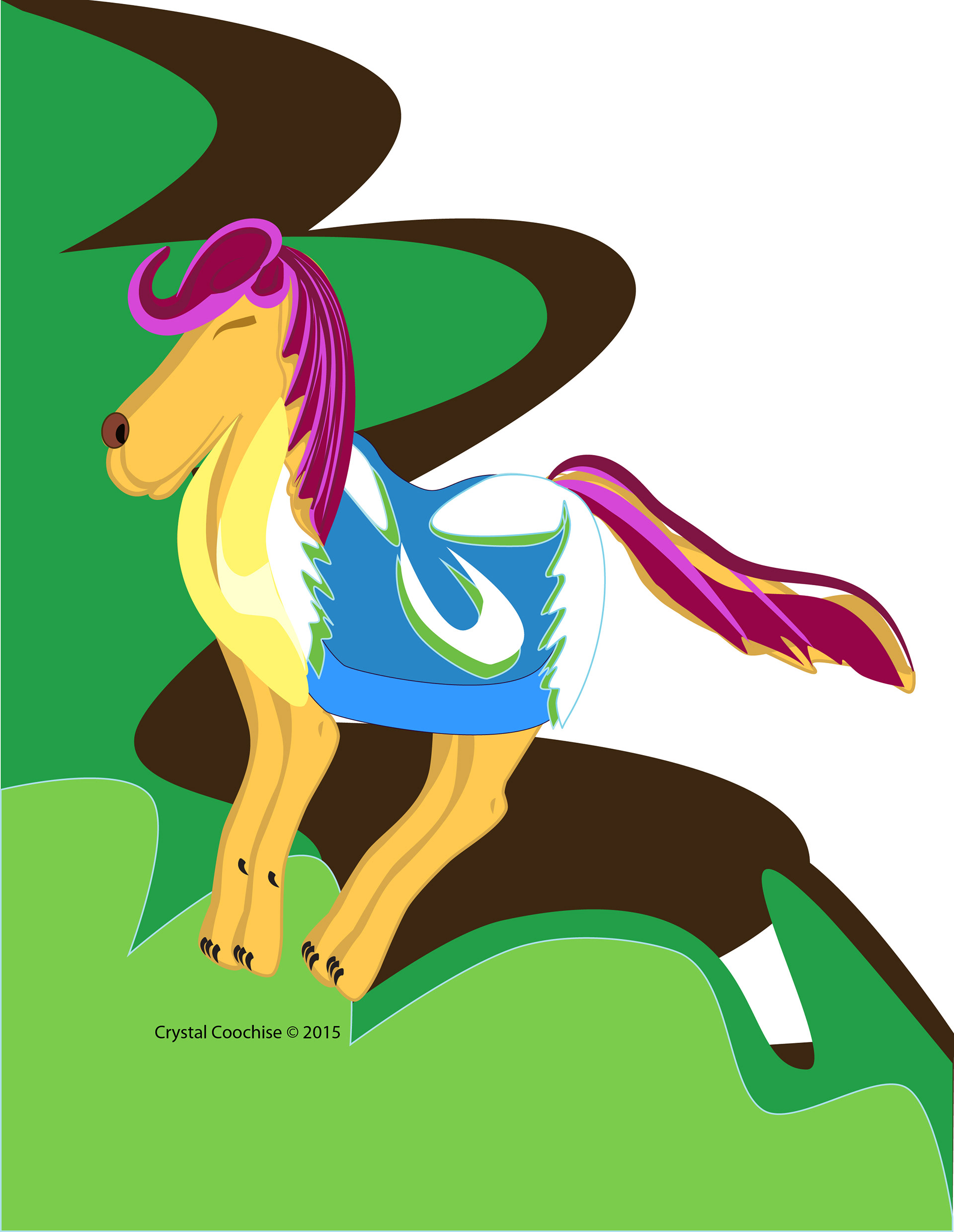
"Horse of the Moon" is a mix between a horse and a dog with new techniques to the tail and multi-colored hair. The Design Came from a black light drawing and was translated into several styles of a horse dog. Output was the size of an 8.5 by 11 inch poster.

"EJ Type" was an experiment with drawing in Adobe Illustrator for a moving video that focused on several parts of the type to talk about visual communications. It showed what was possible with type and drawing as a video with transitions made for a college class.

Matt Papke for city council was a four by four foot sign made to look like a railroad sign. it was built on two stakes and hung like a diamond to be different from the usual square or circle sign to help it stand out from the others running for office.

OPES Financial Solutions is a retirement and long term company that looks at ways to save money for many people looking to have money in years to come saved away. This was a poster, logos, banner, and brochure creation for their company created in Adobe Illustrator, Adobe Photoshop and Adobe In Design.